Cards - Colorful Blocks
Component #1
Learn to develop sites with components and design systems


                      <!-- Articles Section -->
                      <div class="container space-2">
                        <!-- Title -->
                        <div class="w-md-80 w-lg-50 text-center mx-md-auto mb-5 mb-md-9">
                          <h2>Learn to develop sites with components and design systems</h2>
                        </div>
                        <!-- End Title -->

                        <div class="row mx-n2 mx-lg-n3">
                          <div class="col-sm-6 col-lg-4 px-2 px-lg-3 mb-3 mb-lg-0">
                            <!-- Card -->
                            <a class="card bg-primary text-left h-100 transition-3d-hover" href="#">
                              <div class="card-body">
                                <div class="mb-5">
                                  <h3 class="text-white">Documentation</h3>
                                  <p class="text-white">Discover how to build and maintain coding systems using our documentation.</p>
                                </div>
                                <img class="img-fluid w-100" src="../../assets/svg/illustrations/docs-frame.svg" alt="Image Description">
                              </div>
                              <div class="card-footer border-0 bg-transparent pt-0">
                                <span class="font-size-1 text-white font-weight-bold">Learn more <i class="fas fa-angle-right fa-sm ml-1"></i></span>
                              </div>
                            </a>
                            <!-- End Card -->
                          </div>

                          <div class="col-sm-6 col-lg-4 px-2 px-lg-3 mb-3 mb-lg-0">
                            <!-- Card -->
                            <a class="card bg-navy text-left h-100 transition-3d-hover" href="javascript:;">
                              <div class="card-body">
                                <div class="mb-5">
                                  <h3 class="text-white">Snippets</h3>
                                  <p class="text-white">Start browsing our snippets pages with copy-to-clipboard snippets to match Bootstrap's level of quality.</p>
                                </div>
                                <img class="img-fluid w-100" src="../../assets/svg/illustrations/snippets-frame.svg" alt="Image Description">
                              </div>
                              <div class="card-footer border-0 bg-transparent pt-0">
                                <span class="font-size-1 text-white font-weight-bold">Start building <i class="fas fa-angle-right fa-sm ml-1"></i></span>
                              </div>
                            </a>
                            <!-- End Card -->
                          </div>

                          <div class="col-sm-6 col-lg-4 px-2 px-lg-3">
                            <!-- Card -->
                            <a class="card bg-warning text-left h-100 transition-3d-hover" href="javascript:;">
                              <div class="card-body">
                                <div class="mb-5">
                                  <h3 class="text-white">Layout options</h3>
                                  <p class="text-white">Apart from 100+ HTML-pages, the theme comes with 6 ready-to-use and stand-alone demo options.</p>
                                </div>
                                <img class="img-fluid w-100" src="../../assets/svg/illustrations/layouts-frame.svg" alt="Image Description">
                              </div>
                              <div class="card-footer border-0 bg-transparent pt-0">
                                <span class="font-size-1 text-white font-weight-bold">View examples <i class="fas fa-angle-right fa-sm ml-1"></i></span>
                              </div>
                            </a>
                            <!-- End Card -->
                          </div>
                        </div>
                      </div>
                      <!-- End Articles Section -->
Component #2
Featured case studies
We help businesses bring ideas to life in the digital world, by designing and implementing the technology tools that they need to win.
Compatible with Sketch
Front: A digital UI Kit UI Kit
Super clean, minimalistic, stylized mockup collection with awesome customization features and huge resolution.

Building brand through design
Graphic design and illustrationHigh-detailed business scenes for landing pages' headers and mobile screens.

Pixeel Group
Graphic design and illustrationWe work with the largest companies all over the world.
Compatible with Sketch
Atlas: A travel app UI kit from Front UI kit
This UI kit has all you need to manage your hypothetical customer's smart devices like thermostats, lights, and other appliances that make for a connected modern home.
                      <!-- Works Section -->
                      <div class="container space-2">
                        <!-- Title -->
                        <div class="w-lg-60 mb-5 mb-sm-11">
                          <span class="d-block small font-weight-bold text-cap mb-2">Featured case studies</span>
                          <h2 class="text-lh-lg">We help businesses bring ideas to life in the digital world, by designing and implementing the technology tools that they need to win.</h2>
                        </div>
                        <!-- End Title -->

                        <div class="card-md-columns card-md-2-count card-md-2-gap card-lg-5-gap pt-md-11">
                          <!-- Card -->
                          <a class="card shadow-none bg-soft-primary text-indigo transition-3d-hover p-4 p-lg-7 mt-md-n11 mb-3 mb-sm-5 mb-lg-11" href="#">
                            <img class="img-fluid mb-7" src="../../assets/img/755x470/img1.jpg" alt="Image Description">
                            <div class="media align-items-center max-w-35rem mb-3">
                              <div class="mr-3">
                                <img class="img-fluid" src="../../assets/svg/illustrations/sketch.svg" alt="Sketch" width="32">
                              </div>
                              <div class="media-body">
                                <small class="d-block mb-0">Compatible with Sketch</small>
                              </div>
                            </div>
                            <h3 class="d-flex justify-content-between">
                              Front: A digital UI Kit
                              <span class="d-block">
                                <span class="badge badge-success badge-pill ml-3">UI Kit</span>
                              </span>
                            </h3>
                            <p class="text-dark">Super clean, minimalistic, stylized mockup collection with awesome customization features and huge resolution.</p>
                          </a>
                          <!-- End Card -->

                          <!-- Card -->
                          <a class="card shadow-none bg-soft-info text-indigo transition-3d-hover p-4 p-lg-7 mb-3 mb-sm-5 mb-lg-11" href="#">
                            <img class="img-fluid mb-7" src="../../assets/img/mockups/img13.png" alt="Image Description">
                            <h3 class="mb-1">Building brand through design</h3>
                            <small class="d-block mb-3">Graphic design and illustration</small>
                            <p class="text-dark">High-detailed business scenes for landing pages' headers and mobile screens.</p>
                          </a>
                          <!-- End Card -->

                          <!-- Card -->
                          <a class="card shadow-none bg-soft-danger text-indigo transition-3d-hover p-4 p-lg-7 mb-3 mb-sm-5 mb-lg-11" href="#">
                            <img class="img-fluid mb-7" src="../../assets/img/mockups/img12.png" alt="Image Description">
                            <h3 class="mb-1">Pixeel Group</h3>
                            <small class="d-block mb-3">Graphic design and illustration</small>
                            <p class="text-dark">We work with the largest companies all over the world.</p>
                          </a>
                          <!-- End Card -->

                          <!-- Card -->
                          <a class="card shadow-none bg-soft-indigo text-indigo transition-3d-hover p-4 p-lg-7 mb-3 mb-sm-5 mb-lg-11" href="#">
                            <img class="img-fluid mb-7" src="../../assets/img/mockups/img11.png" alt="Image Description">
                            <div class="media align-items-center max-w-35rem mb-3">
                              <div class="mr-3">
                                <img class="img-fluid" src="../../assets/svg/illustrations/sketch.svg" alt="Sketch" width="32">
                              </div>
                              <div class="media-body">
                                <small class="d-block mb-0">Compatible with Sketch</small>
                              </div>
                            </div>
                            <h3 class="d-flex justify-content-between">
                              Atlas: A travel app UI kit from Front
                              <span class="d-block">
                                <span class="badge badge-success badge-pill ml-3">UI kit</span>
                              </span>
                            </h3>
                            <p class="text-dark">This UI kit has all you need to manage your hypothetical customer's smart devices like thermostats, lights, and other appliances that make for a connected modern home.</p>
                          </a>
                          <!-- End Card -->
                        </div>

                        <div class="text-center mt-7 mt-lg-0">
                          <a class="btn btn-primary btn-wide transition-3d-hover px-sm-5" href="#">View All Works</a>
                        </div>
                      </div>
                      <!-- End Works Section -->
Component #3
<!-- Portfolio Section -->
<div class="container">
<!-- Card -->
<a class="card shadow-none bg-soft-success text-inherit transition-3d-hover p-4 p-md-7" href="#">
<div class="row">
<div class="col-lg-4 order-lg-2 mb-5 mb-lg-0">
<div class="d-flex flex-column h-100">
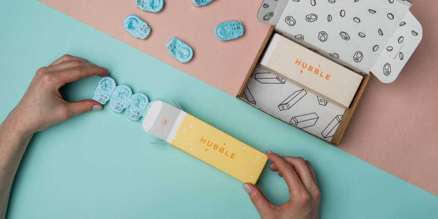
<div class="mb-7">
<h2 class="h1">Hubble</h2>
<p class="text-body">The more affordable daily contact lens. Modify or cancel anytime.</p>
</div>
<!-- Testimonials -->
<div class="card shadow-none p-4 mt-auto">
<div class="mb-3">
<img class="clients mr-auto" src="../../assets/svg/clients-logo/fitbit-original.svg" alt="SVG Logo">
</div>
<div class="mb-3">
<blockquote class="text-dark">"The template is really nice and offers quite a large set of options. It's beautiful and the coding is done quickly and seamlessly. Thank you!"</blockquote>
</div>
<div class="media">
<div class="avatar avatar-circle mr-3">
<img class="avatar-img" src="../../assets/img/100x100/img3.jpg" alt="Image Description">
</div>
<div class="media-body">
<span class="d-block h5 mb-0">Max</span>
<small class="d-block text-muted">Fitbit Agency Partner</small>
</div>
</div>
</div>
<!-- End Testimonials -->
</div>
</div>
<div class="col-lg-8 order-lg-1">
<!-- Info -->
<div class="mb-5">
<img class="img-fluid rounded" src="../../assets/img/900x450/img15.jpg" alt="Image Description">
</div>
<div class="row">
<div class="col-sm-6 mb-3 mb-sm-0">
<h4>Support and win</h4>
<p class="text-body">When we empower others to succeed, we all win. (And we're not talking about participation trophies.)</p>
</div>
<div class="col-sm-6">
<h4>Open communication</h4>
<p class="text-body">We're big fans of transparency for many reasons, but the abridged version is: it makes easier.</p>
</div>
</div>
<!-- End Info -->
</div>
</div>
</a>
<!-- End Card -->
</div>
<!-- End Portfolio Section -->
Component #4
What's included
3 Color skins included
Easily construct new pages using any of 12 pre-made grids and a huge amount of components and elements.
                      <!-- Features Section -->
                      <div class="container space-2">
                        <!-- Title -->
                        <div class="w-lg-50 text-center mx-lg-auto mb-7">
                          <span class="d-block small font-weight-bold text-cap mb-2">What's included</span>
                          <h2>3 Color skins included</h2>
                          <p>Easily construct new pages using any of 12 pre-made grids and a huge amount of components and elements.</p>
                        </div>
                        <!-- End Title -->

                        <div class="js-slick-carousel slick slick-equal-height slick-gutters-3 mb-7"
                             data-hs-slick-carousel-options='{
                               "slidesToShow": 3,
                               "dots": true,
                               "dotsClass": "slick-pagination d-lg-none mt-5",
                               "responsive": [{
                                 "breakpoint": 992,
                                 "settings": {
                                   "slidesToShow": 2
                                  }
                                 }, {
                                 "breakpoint": 768,
                                 "settings": {
                                   "slidesToShow": 2
                                  }
                                 }, {
                                 "breakpoint": 554,
                                 "settings": {
                                   "slidesToShow": 1
                                 }
                               }]
                             }'>
                          <div class="js-slide">
                            <!-- Card -->
                            <div class="w-100 bg-soft-primary text-center rounded p-5">
                              <img class="img-fluid" src="../../assets/img/mockups/img7.png" alt="Image Description">
                              <h3 class="text-primary">Standard</h3>
                              <p class="font-size-1">Available in:</p>
                              <div class="mb-4">
                                <img class="d-inline-block mr-2" src="../../assets/svg/illustrations/sketch.svg" alt="Sketch" width="25">
                                <img class="d-inline-block" src="../../assets/svg/illustrations/adobe-xd.svg" alt="Adobe Xd" width="25">
                              </div>
                              <a class="btn btn-sm btn-block btn-primary transition-3d-hover" href="#">Preview <i class="fas fa-eye ml-1"></i></a>
                            </div>
                            <!-- End Card -->
                          </div>

                          <div class="js-slide">
                            <!-- Card -->
                            <div class="w-100 bg-soft-info text-center rounded p-5">
                              <img class="img-fluid" src="../../assets/img/mockups/img8.png" alt="Image Description">
                              <h3>Dark</h3>
                              <p class="font-size-1">Available in:</p>
                              <div class="mb-4">
                                <img class="d-inline-block" src="../../assets/svg/illustrations/sketch.svg" alt="Sketch" width="25">
                              </div>
                              <a class="btn btn-sm btn-block bg-white transition-3d-hover disabled" href="#">Coming soon ...</a>
                            </div>
                            <!-- End Card -->
                          </div>

                          <div class="js-slide">
                            <!-- Card -->
                            <div class="w-100 bg-soft-danger text-center rounded p-5">
                              <img class="img-fluid" src="../../assets/img/mockups/img9.png" alt="Image Description">
                              <h3>Wireframe</h3>
                              <p class="font-size-1">Available in:</p>
                              <div class="mb-4">
                                <img class="d-inline-block mr-2" src="../../assets/svg/illustrations/sketch.svg" alt="Sketch" width="25">
                                <img class="d-inline-block" src="../../assets/svg/illustrations/adobe-xd.svg" alt="Adobe Xd" width="25">
                              </div>
                              <a class="btn btn-sm btn-block bg-white transition-3d-hover disabled" href="#">Coming soon ...</a>
                            </div>
                            <!-- End Card -->
                          </div>
                        </div>

                        <!-- Fancybox -->
                        <div class="text-center">
                          <a class="js-fancybox d-flex justify-content-center align-items-center" href="javascript:;"
                             data-hs-fancybox-options='{
                               "src": "//youtube.com/0qisGSwZym4",
                               "caption": "Front - Responsive Website Template",
                               "speed": 700,
                               "buttons": ["fullScreen", "close"],
                               "youtube": {
                                 "autoplay": 1
                               }
                             }'>
                            <i class="fas fa-play-circle font-size-2 font-weight-bold align-middle"></i>
                            <span class="ml-1">
                              Watch and learn how it works
                            </span>
                          </a>
                        </div>
                        <!-- End Fancybox -->
                      </div>
                      <!-- End Features Section -->
                      <link rel="stylesheet" href="../../assets/vendor/fancybox/dist/jquery.fancybox.min.css">
                      <link rel="stylesheet" href="../../assets/vendor/slick-carousel/slick/slick.css">
                      <!-- JS Implementing Plugins -->
                      <script src="../../assets/vendor/fancybox/dist/jquery.fancybox.min.js"></script>
                      <script src="../../assets/vendor/slick-carousel/slick/slick.js"></script>

                      <!-- JS Front -->
                      <script src="../../assets/js/hs.fancybox.js"></script>
                      <script src="../../assets/js/hs.slick-carousel.js"></script>

                      <!-- JS Plugins Init. -->
                      <script>
                        $(document).on('ready', function () {
                          // initialization of fancybox
                          $('.js-fancybox').each(function () {
                            var fancybox = $.HSCore.components.HSFancyBox.init($(this));
                          });

                          // initialization of slick carousel
                          $('.js-slick-carousel').each(function() {
                            var slickCarousel = $.HSCore.components.HSSlickCarousel.init($(this));
                          });
                        });
                      </script>
Component #5
Front process
Once you are invited to Front Agency, you company will be set within days.
Find Out More
Product design
Easy and fast adjustments of elements are possible with Front template.
Find Out More
                      <!-- Services Section -->
                      <div class="container">
                        <div class="row">
                          <div class="col-lg-6 mb-3 mb-lg-0">
                            <!-- Card -->
                            <div class="card bg-primary text-white h-100 overflow-hidden p-5">
                              <div class="w-65 pr-2">
                                <h2 class="text-white">Front process</h2>
                                <p class="text-white">Once you are invited to Front Agency, you company will be set within days.</p>
                                <a class="btn btn-sm btn-light transition-3d-hover" href="#">Find Out More <i class="fas fa-angle-right ml-1"></i></a>
                              </div>
                              <div class="position-absolute right-0 bottom-0 w-50 mb-n3 mr-n4">
                                <img class="img-fluid" src="../../assets/img/mockups/img15.png" alt="Image Description">
                              </div>
                            </div>
                            <!-- End Card -->
                          </div>

                          <div class="col-lg-6">
                            <!-- Card -->
                            <div class="card bg-warning text-white h-100 overflow-hidden p-5">
                              <div class="w-65 pr-2">
                                <h2 class="text-white">Product design</h2>
                                <p class="text-white">Easy and fast adjustments of elements are possible with Front template.</p>
                                <a class="btn btn-sm btn-light transition-3d-hover" href="#">Find Out More <i class="fas fa-angle-right ml-1"></i></a>
                              </div>
                              <div class="position-absolute right-0 bottom-0 w-50 mb-n3 mr-n4">
                                <img class="img-fluid" src="../../assets/img/mockups/img12.png" alt="Image Description">
                              </div>
                            </div>
                            <!-- End Card -->
                          </div>
                        </div>
                      </div>
                      <!-- End Services Section -->