Chartist.js
Display graphically quantitative data on your websites.
Official documentation
For more detailed information and examples, see the official documentation: Chartist.js.
How to use?
Copy-paste the stylesheets <link> into your <head> to load the CSS.
              <link rel="stylesheet" href="../../assets/vendor/chartist/dist/chartist.min.css">
              <link rel="stylesheet" href="../../assets/vendor/chartist-plugin-tooltip/dist/chartist-plugin-tooltip.css">
Copy-paste the following <script>s near the end of your pages under JS Implementing Plugins to enable them.
              <script src="../../assets/vendor/chartist/dist/chartist.min.js"></script>
              <script src="../../assets/vendor/chartist-plugin-tooltip/dist/chartist-plugin-tooltip.min.js"></script>
Copy-paste the following <script> near the end of your pages under JS Nova to enable it.
<script src="../../assets/js/components/hs.chartist-area.js"></script>
Copy-paste the init function under JS Plugins Init., before the closing </body> tag, to enable it.
              <script>
                $(document).on('ready', function () {
                  // initialization of chartist area charts
                  $.HSCore.components.HSChartistArea.init('.js-area-chart');
                });
              </script>
Basic example
                    <!-- Area Chart -->
                    <div class="js-area-chart chart--points-invisible"
                         data-series='[[
                               {"meta":"Bitcoin","value":"70"},
                               {"meta":"Bitcoin","value":"52"},
                               {"meta":"Bitcoin","value":"47"},
                               {"meta":"Bitcoin","value":"58"},
                               {"meta":"Bitcoin","value":"38"},
                               {"meta":"Bitcoin","value":"40"},
                               {"meta":"Bitcoin","value":"57"},
                               {"meta":"Bitcoin","value":"40"},
                               {"meta":"Bitcoin","value":"31"},
                               {"meta":"Bitcoin","value":"53"},
                               {"meta":"Bitcoin","value":"60"},
                               {"meta":"Bitcoin","value":"43"},
                               {"meta":"Bitcoin","value":"70"},
                               {"meta":"Bitcoin","value":"52"},
                               {"meta":"Bitcoin","value":"47"},
                               {"meta":"Bitcoin","value":"58"},
                               {"meta":"Bitcoin","value":"38"},
                               {"meta":"Bitcoin","value":"40"},
                               {"meta":"Bitcoin","value":"57"},
                               {"meta":"Bitcoin","value":"40"},
                               {"meta":"Bitcoin","value":"31"},
                               {"meta":"Bitcoin","value":"53"},
                               {"meta":"Bitcoin","value":"60"},
                               {"meta":"Bitcoin","value":"43"}
                             ]
                           ]'
                         data-labels='["1AM","2AM","3AM","4AM","5AM","6AM","7AM","8AM","9AM","10AM","11AM","12AM","1PM","2PM","3PM","4PM","5PM","6PM","7PM","8PM","9PM","10PM","11PM","12PM"]'
                         data-labels-qty="12"
                         data-labels-start-from="1"
                         data-height="205"
                         data-mobile-height="100"
                         data-high="150"
                         data-chart-padding='{"top": 5}'
                         data-offset-x="30"
                         data-offset-y="30"
                         data-is-show-axis-x="false"
                         data-is-show-axis-y="true"
                         data-is-hide-area="true"
                         data-line-colors='["#8069f2"]'
                         data-line-dasharrays="[0]"
                         data-line-width='["2px"]'
                         data-is-line-smooth="[true]"
                         data-fill-opacity="1"
                         data-fill-colors='["#8069f2"]'
                         data-stroke-color-axis-x="#eeeef1"
                         data-stroke-dasharray-axis-x="none"
                         data-text-size-x="12px"
                         data-text-color-x="#8b8e9f"
                         data-text-offset-top-x="15"
                         data-text-align-axis-x="center"
                         data-text-size-y="12px"
                         data-text-color-y="#868e96"
                         data-is-show-tooltips="true"
                         data-tooltip-custom-class="chart-tooltip chart-tooltip--sections-blocked chart-tooltip__meta--text-muted small text-white text-nowrap p-2"
                         data-tooltip-currency="USD "
                         data-is-show-points="true"
                         data-point-custom-class="chart__point--donut chart__point--border-xs border-primary rounded-circle"
                         data-point-dimensions='{"width":15,"height":15}'></div>
                    <!-- End Area Chart -->
Methods
Options can be passed via data attributes or JavaScript. For data attributes, append the option name to data-, as in data-series="".
| Attribute | Description |
|---|---|
data-is-fill-colors-gradient |
if true, then data-fill-colors should have 2 parameters for each graphic. Required for gradient graphs.
For example: |
data-line-colors |
Graph line colors. |
data-line-width |
Width of the graphs lines. |
data-line-dasharrays |
Defines the width of the interrupt lines of the graphs. If the value is 0 or absent, then the line is solid. |
data-stroke-color-axis-x |
the lines’ colour along the X axis in the background. |
data-stroke-color-axis-y |
the lines colour of the graph along the Y axis in the background. |
data-dasharray-color-axis-x |
the lines colour on the background on the X axis on the background. |
data-dasharray-color-axis-y |
the lines color on the background along the Y axis on the background. |
data-is-side-stroke-hidden-axis-x |
if true, it removes side-lines in the background |
data-labels-qty |
The number of labels displayed on the X axis. |
data-labels-start-from |
determines from which account the label on the X axis to start the counting of the displayed labels. |
data-is-show-area |
Determines whether the graph itself is visible. |
data-is-show-point |
Determines whether the points on the graph are shown. |
data-is-show-axis-x |
Determines whether lines will be displayed against the background of the chart along the X axis. |
data-is-show-axis-y |
Determines whether lines will be displayed against the background of the chart along the Y axis. |
data-is-show-tooltips |
Determines whether hover prompts specified in the data-series attribute are displayed. |
data-tooltip-description-position |
Determines which side of the description will be specified in the tooltip. Possible values:
|
data-tooltip-custom-class |
Adds additional classes to the prompt. |
data-fill-opacity |
Opacity of the charts. |
data-fill-colors |
Fill color. |
data-stroke-color |
Stroke color. |
data-stroke-dash-array |
If the value of the attribute is 0, then the lines on the background are solid. If greater than 0, then determines the distance between the line generators lines. |
data-text-size-x |
The font size for labels on the X axis. |
data-text-size-y |
The font size for labels on the Y axis. |
data-text-offset-top-x |
The distance from the text to the chart is along the x-axis. |
data-text-align-axis-x |
Label text alignment along the X axis. Possible values:
|
data-text-align-axis-y |
Label text alignment along the Y axis. Possible values:
|
data-text-offset-top-y |
The distance to the right of the text to the graph along the Y axis. |
data-text-color-x |
The text color of labels in the X axis. |
data-text-color-y |
The text color of labels in the Y axis. |
data-points-colors |
Colors of points on the graph. |
data-is-hide-area |
if true, the graph will be indicated only by a line. |
data-is-hide-line |
if true, the graph will not have a line. |
data-is-tooltip-divided |
includes a mode in which the tooltip is divided into two separate parts.
Screenshot example: 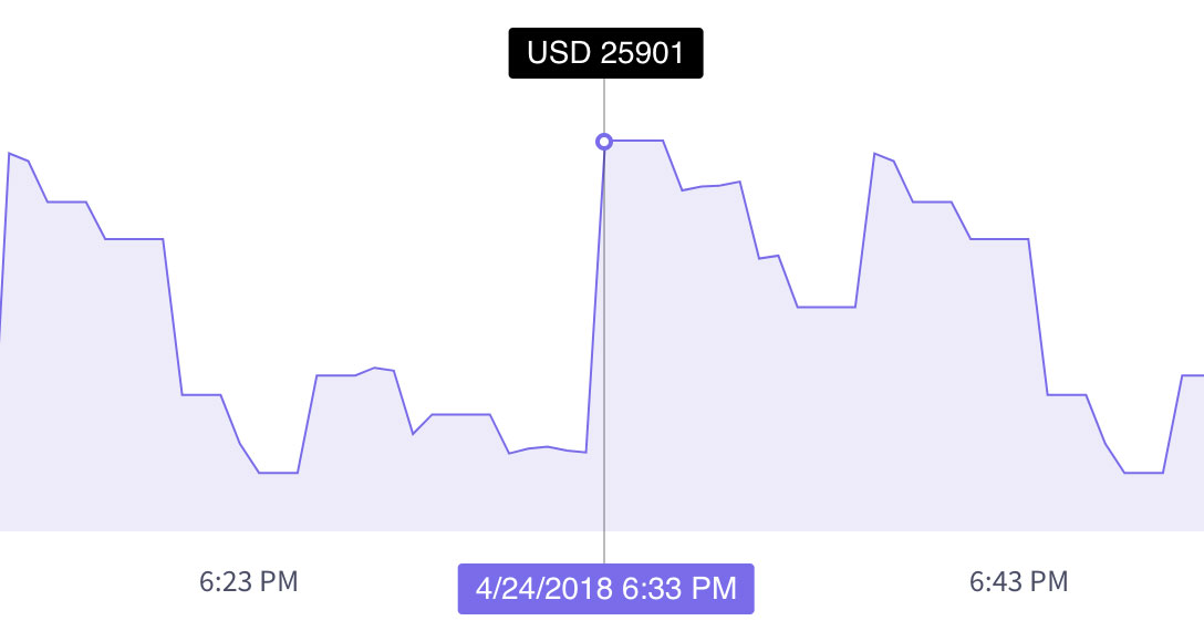
|
data-tooltip-badge-markup |
sets mark-up for points. |
data-is-tooltips-append-to-body |
if true, then tooltips are positioned relative to the browser window. |
data-is-tooltip-reverse-data |
if true, it changes the display order of value and description. |
data-tooltip-currency |
prefix substituted before value in tooltips. |
data-is-tooltip-currency-reverse |
if true, then puts the value before the currency sign in tooltips.. |
data-is-show-points |
determines whether points are shown on the graph. |
data-point-custom-class |
adds extra classes to the points on the graph. |
data-point-dimensions |
determines the size of points on the graph. |
data-series |
The data on which the graphics will be based. Each value corresponds to a point on the graph. Also, this data is displayed in the tooltip that appears when you hover over the cursor.
Screenshot example: 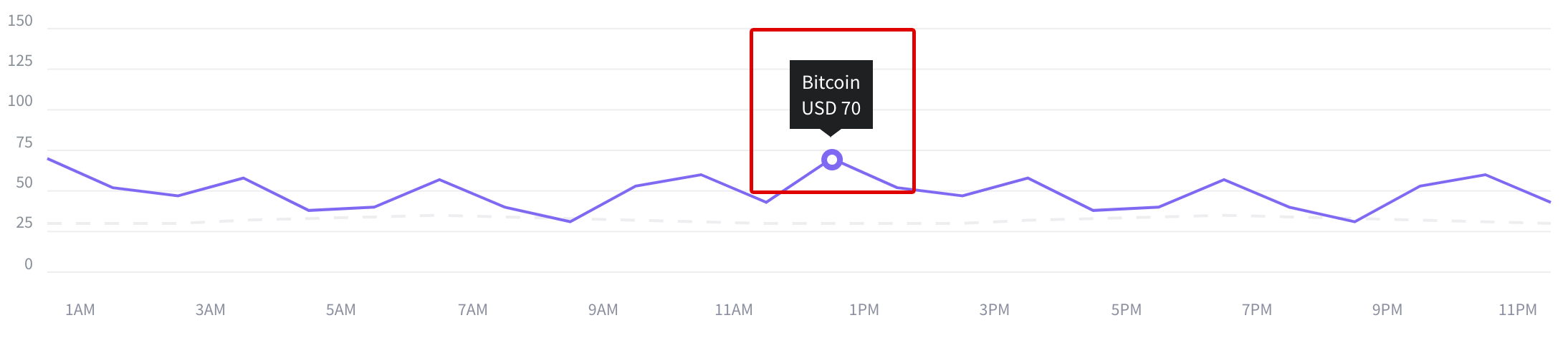
|
data-labels |
Labels along the X axis.
Screenshot example: 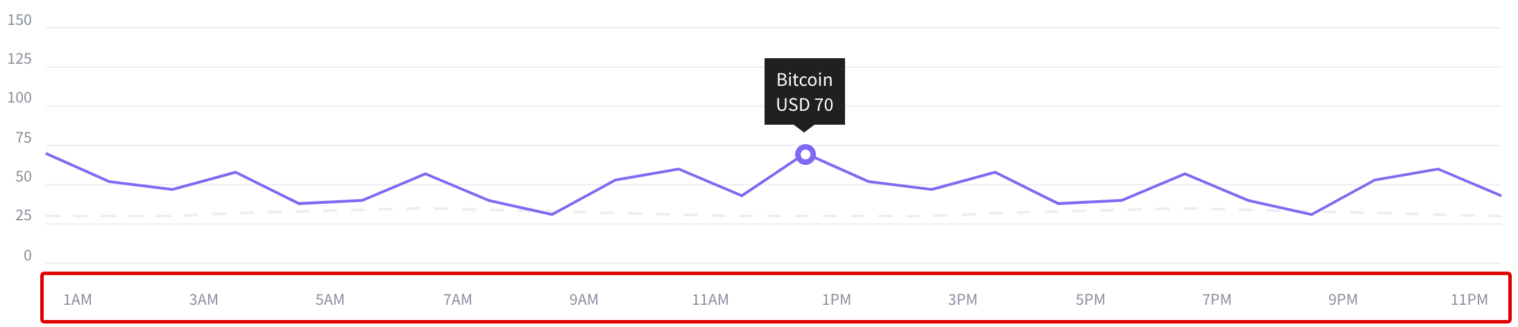
|
data-width |
width of the chart. |
data-is-full-width |
Stretches the chart for the entire width of the grid. |
data-height |
Chart height. |
data-mobile-height |
Chart height at resolution less than 768 px. |
data-high |
Highest value on the chart.
Screenshot example: 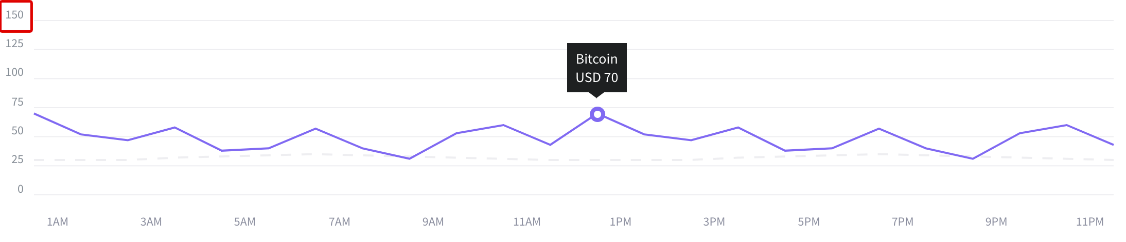
|
data-low |
The lowest value on the graph. Can be negative. In this case, the graph will go below the zero point.
Screenshot example: 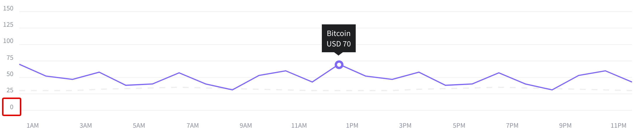
|
data-offset-x |
The offset from the edge of the chart to the labels along the X axis. |
data-offset-y |
The offset from the edge of the chart to the labels along the Y axis. |
data-prefix |
prefix which is put before each label on the Y axis. |
data-postfix |
Postfix is put after each label on the Y axis.
Screenshot example: 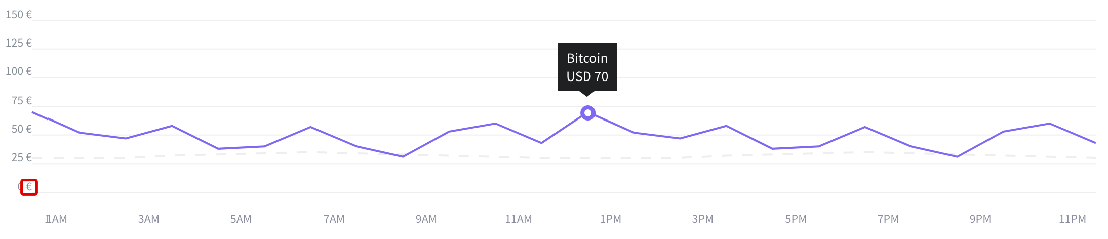
|
data-align-text-axis-x |
Align labels to the X axis. Possible values:
|
data-chart-padding |
defines paddings from the edges of the area in which the graph is located. |
How to use?
Copy-paste the stylesheets <link> into your <head> to load the CSS.
              <link rel="stylesheet" href="../../assets/vendor/chartist/dist/chartist.min.css">
              <link rel="stylesheet" href="../../assets/vendor/chartist-plugin-tooltip/dist/chartist-plugin-tooltip.css">
Copy-paste the following <script>s near the end of your pages under JS Implementing Plugins to enable them.
	            <script src="../../assets/vendor/chartist/dist/chartist.min.js"></script>
	            <script src="../../assets/vendor/chartist-bar-labels/src/scripts/chartist-bar-labels.js"></script>
              <script src="../../assets/vendor/chartist-plugin-tooltip/dist/chartist-plugin-tooltip.min.js"></script>
Copy-paste the following <script> near the end of your pages under JS Nova to enable it.
<script src="../../assets/js/components/hs.chartist-bar.js"></script>
Copy-paste the init function under JS Plugins Init., before the closing </body> tag, to enable it.
              <script>
                $(document).on('ready', function () {
                  // initialization of chartist bar charts
                  $.HSCore.components.HSChartistBar.init('.js-bar-chart');
                });
              </script>
Basic example
	                  <!-- Bar Chart -->
                    <div class="js-bar-chart"
                         data-series="[
				                         [40,124,61,124,200,0,0,169,108,124,173],
				                         [30,114,51,114,126,0,0,159,98,114,136],
				                         [20,104,41,104,109,0,0,104,64,104,126]
				                       ]"
                         data-labels='["Mon","Tue","Wed","Thu","Fri","Sat","Sun","Mon","Tue","Wed","Thu"]'
                         data-is-stack-bars="true"
                         data-is-show-axis-x="false"
                         data-is-show-axis-y="true"
                         data-is-show-label-axis-x="true"
                         data-is-show-label-axis-y="true"
                         data-height="260"
                         data-mobile-height="200"
                         data-high="200"
                         data-offset-axis-x="23"
                         data-offset-axis-y="30"
                         data-low="0"
                         data-distance="52"
                         data-stroke-width="40"
                         data-mobile-stroke-width="20"
                         data-stroke-color='["#fcd53b","#07d7f7","#8069f2"]'
                         data-is-grid-solid-line="true"
                         data-grid-line-color="#eeeef1"
                         data-label-color-axis-x="#4a4e69"
                         data-label-font-size-axis-x="14px"
                         data-label-color-axis-y="#868e96"
                         data-label-font-size-axis-y="14px"
                         data-is-show-tooltips="true"
                         data-postfix="%"
                         data-tooltip-custom-class="chart-tooltip chart-tooltip--black small text-white px-2 py-1"></div>
	                  <!-- End Bar Chart -->
Methods
Options can be passed via data attributes or JavaScript. For data attributes, append the option name to data-, as in data-series="".
| Attribute | Description |
|---|---|
data-stroke-width |
The width of the individual column. |
data-mobile-stroke-width |
the width of a single column at a resolution below 768px |
data-stroke-color |
Stroke color. |
data-series |
The data on which the graphics will be based. |
data-labels |
labels along the X axis. |
data-is-horizontal-bars |
if true, then the graph is not built from bottom to top, but from right to left.
Screenshot example: 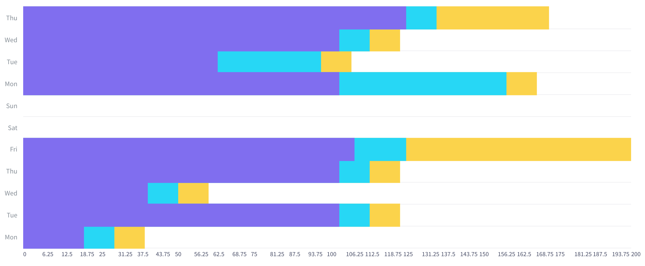
|
data-height |
Chart height. |
data-mobile-height |
graph height at a resolution below 768px. |
data-high |
Highest value on the chart. |
data-low |
the smallest value in the graph. May be negative. In this case, the graph will go below the zero point. |
data-distance |
distance between posts. |
data-is-full-width |
if true, the graphic becomes adaptive in width. defines indents from the edges of the area in which the graph is located. |
data-chart-padding |
indent from the edge of the graph to the labels along the X axis. |
data-is-show-axis-x |
Determines whether lines are displayed against the background of the graph along the X axis. |
data-is-show-axis-y |
Determines whether lines are displayed against the background of the graph along the Y axis. |
data-offset-axis-x |
indent from the edge of the graph to the labels along the X axis. |
data-offset-axis-y |
indent from the edge of the graph to the labels along the Y axis. |
data-is-stack-bars |
if true, then turns on the mode in which several columns merge into one.
Screenshot example: 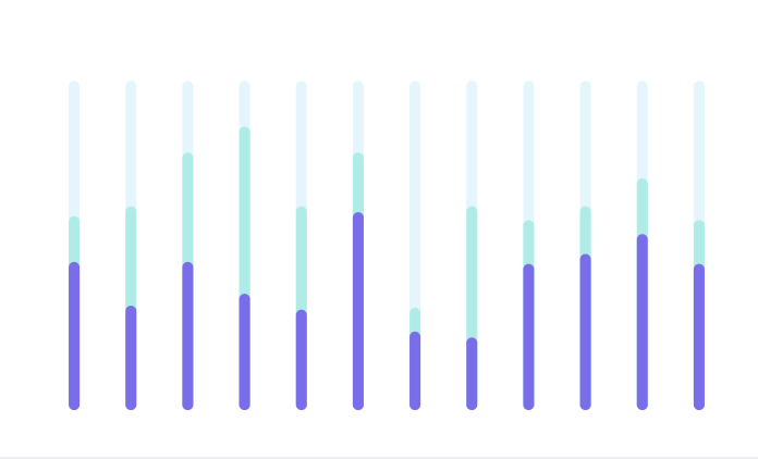
|
data-labels-qty |
The number of labels displayed on the X axis. |
data-labels-start-from |
determines from which account the label on the X axis to start the counting of the displayed labels. |
data-is-show-label-axis-x |
if false, it does not show labels on the X axis. |
data-is-show-label-axis-y |
if false, it does not show labels on the Y axis. |
data-label-color-axis-x |
Label text color along the X axis. |
data-label-color-axis-y |
Label text colour on Y axis. |
data-label-font-size-axis-x |
The font size of labels along the X axis. |
data-label-font-size-axis-y |
Label font size on the Y axis. |
data-text-offset-top-x |
Distance from the top of the text to the graph on the X axis. |
data-is-show-tooltips |
determines whether hints are shown, the values of which are taken from the data-series attribute. |
data-tooltip-custom-class |
adds extra classes to the tooltip. |
data-tooltip-currency |
prefix substituted before value in tooltips. |
data-is-grid-solid-line |
if true, the lines on the background become solid. |
data-grid-line-color |
color lines on the background. |
data-is-show-bar-labels |
if true, then static labels appear on the columns, the values of which are taken from the data-series attribute. |
data-is-stroke-rounded |
if true, the columns will have rounding. |
How to use?
Copy-paste the stylesheets <link> into your <head> to load the CSS.
              <link rel="stylesheet" href="../../assets/vendor/chartist/dist/chartist.min.css">
              <link rel="stylesheet" href="../../assets/vendor/chartist-plugin-tooltip/dist/chartist-plugin-tooltip.css">
Copy-paste the following <script>s near the end of your pages under JS Implementing Plugins to enable them.
	            <script src="../../assets/vendor/chartist/dist/chartist.min.js"></script>
              <script src="../../assets/vendor/chartist-plugin-tooltip/dist/chartist-plugin-tooltip.min.js"></script>
Copy-paste the following <script> near the end of your pages under JS Nova to enable it.
<script src="../../assets/js/components/hs.chartist-donut.js"></script>
Copy-paste the init function under JS Plugins Init., before the closing </body> tag, to enable it.
              <script>
                $(document).on('ready', function () {
                  // initialization of chartist donut charts
                  $.HSCore.components.HSChartistDonut.init('.js-donut-chart');
                });
              </script>
Basic example
	                  <!-- Donut Chart -->
	                  <div class="js-donut-chart position-relative d-flex mx-auto" style="width: 240px; height: 240px;"
	                       data-series='[
		                       {"meta":"Available - ","value":65},
		                       {"meta":"Spent - ","value":35}
		                     ]'
	                       data-border-width="8"
	                       data-start-angle="0"
	                       data-fill-colors='["#8069f2","#eeeef1"]'
	                       data-is-show-tooltips="true"
	                       data-tooltip-currency="%"
	                       data-is-tooltip-currency-reverse="true"
	                       data-tooltip-custom-class="chart-tooltip chart-tooltip--none-triangle chart-tooltip--centered chart-tooltip--black small text-white text-nowrap px-2 py-1"></div>
	                  <!-- End Donut Chart -->
Methods
Options can be passed via data attributes or JavaScript. For data attributes, append the option name to data-, as in data-series="".
| Attribute | Description |
|---|---|
data-fill-colors |
determines the colors of the fractions of the graph. |
data-series |
Data on the basis of which the graph will be built. The percentage of graph shares. |
data-border-width |
determines the width of the graphs. |
data-start-angle |
determines from which angle the chart will begin. |
data-is-show-tooltips |
determines whether hints are shown, the values of which are taken from the attribute data-series. |
data-tooltip-badge-markup |
sets markup for points. |
data-is-tooltip-reverse-data |
if true, it changes the display order of value and description. |
data-tooltip-custom-class |
adds extra classes to the tooltip. |
data-tooltip-currency |
prefix substituted before value in tooltips. |
data-is-tooltip-currency-reverse |
if true, then puts the value before the currency sign in tooltips. |
data-slice-margin |
determines the distance between the segments of the graph.
Screenshot example: 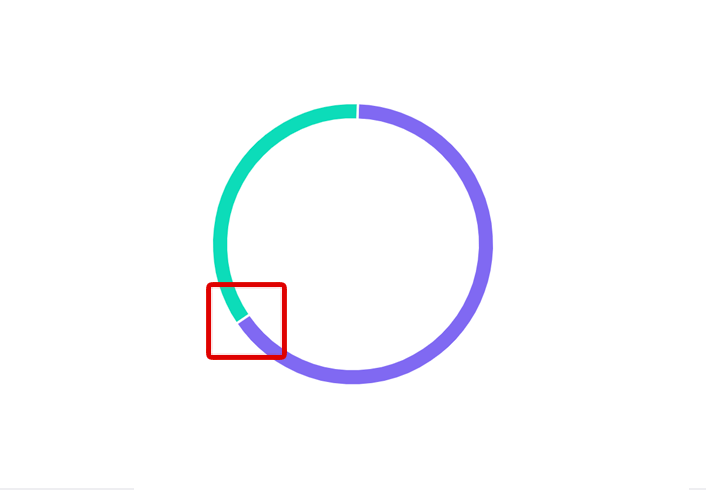
|
How to use?
Copy-paste the stylesheets <link> into your <head> to load the CSS.
<link rel="stylesheet" href="../../assets/vendor/chartist/dist/chartist.min.css">
Copy-paste the following <script>s near the end of your pages under JS Implementing Plugins to enable them.
<script src="../../assets/vendor/chartist/dist/chartist.min.js"></script>
Copy-paste the following <script> near the end of your pages under JS Nova to enable it.
<script src="../../assets/js/components/hs.chartist-pie.js"></script>
Copy-paste the init function under JS Plugins Init., before the closing </body> tag, to enable it.
              <script>
                $(document).on('ready', function () {
                  // initialization of chartist pie charts
                  $.HSCore.components.HSChartistPie.init('.js-pie-chart');
                });
              </script>
Basic example
	                  <!-- Pie Chart -->
	                  <div class="js-pie-chart position-relative d-flex mx-auto" style="width: 240px; height: 240px;"
                         data-fill-colors='["#8069f2","#eeeef1"]'
                         data-series="[50,50,50]"
                         data-start-angle="180"></div>
	                  <!-- End Pie Chart -->
Methods
Options can be passed via data attributes or JavaScript. For data attributes, append the option name to data-, as in data-series="".
| Attribute | Description |
|---|---|
data-fill-colors |
determines the colors of the fractions of the graph. |
data-start-angle |
determines from which angle the chart will begin. |
data-series |
Data on the basis of which the graph will be built. The percentage of graph shares. |