Blogs Grid
Component #1
Space features
Read how we've helped some great companies brand, design and get to market.

Attract
This is where we really begin to visualize your napkin sketches and make them into beautiful pixels.
Learn more Attract
Grow
Now that we've aligned the details, it's time to get things mapped out and organized.
Learn more Grow
Retain
We embrace and drive change in our industry which allows us to keep our clients relevant.
Learn more Retain
                <!-- Features -->
                <div class="container content-space-1">
                  <!-- Heading -->
                  <div class="w-lg-65 text-center mx-lg-auto mb-7">
                    <h3>Space features</h3>
                    <p class="fs-6">Read how we've helped some great companies brand, design and get to market.</p>
                  </div>
                  <!-- End Heading -->

                  <div class="row">
                    <div class="col-sm-6 col-md-4 mb-5 mb-md-0">
                      <!-- Card -->
                      <div class="card card-flush>
                        <img class="card-img" src="../assets/img/600x400/img2.jpg" alt="Image Description">
                        <div class="card-body>
                          <h5 class="card-title"><a class="text-dark" href="#">Attract</a></h5>
                          <p class="card-text">This is where we really begin to visualize your napkin sketches and make them into beautiful pixels.</p>
                          <a class="card-link" href="../blog-classic.html">Learn more Attract <i class="bi-chevron-right small ms-1"></i></a>
                        </div>
                      </div>
                      <!-- End Card -->
                    </div>
                    <!-- End Col -->

                    <div class="col-sm-6 col-md-4 mb-5 mb-md-0">
                      <!-- Card -->
                      <div class="card card-flush>
                        <img class="card-img" src="../assets/img/600x400/img1.jpg" alt="Image Description">
                        <div class="card-body>
                          <h5 class="card-title"><a class="text-dark" href="#">Grow</a></h5>
                          <p class="card-text">Now that we've aligned the details, it's time to get things mapped out and organized.</p>
                          <a class="card-link" href="../blog-classic.html">Learn more Grow <i class="bi-chevron-right small ms-1"></i></a>
                        </div>
                      </div>
                      <!-- End Card -->
                    </div>

                    <div class="col-sm-6 col-md-4">
                      <!-- Card -->
                      <div class="card card-flush>
                        <img class="card-img" src="../assets/img/600x400/img3.jpg" alt="Image Description">
                        <div class="card-body>
                          <h5 class="card-title"><a class="text-dark" href="#">Retain</a></h5>
                          <p class="card-text">We embrace and drive change in our industry which allows us to keep our clients relevant.</p>
                          <a class="card-link" href="../blog-classic.html">Learn more Retain <i class="bi-chevron-right small ms-1"></i></a>
                        </div>
                      </div>
                      <!-- End Card -->
                    </div>
                    <!-- End Col -->
                  </div>
                  <!-- End Row -->
                </div>
                <!-- End Features -->
Component #2
The work we do,
and the people we help
Get started with any of our best-in-class website templates and customize it to fit your needs, whether it's contact forms or color palettes. Making a beautiful website has never been faster.
Want to see more?
See all case studies
                <!-- Blogs -->
                <div class="container content-space-1">
                  <!-- Heading -->
                  <div class="w-lg-65 text-center mx-lg-auto mb-7">
                    <h3>The work we do,<br>and the people we help</h3>
                    <p>Get started with any of our best-in-class website templates and customize it to fit your needs, whether it's contact forms or color palettes. Making a beautiful website has never been faster.</p>
                  </div>
                  <!-- End Heading -->

                  <div class="row mb-5">
                    <div class="col-sm-6 col-md-4 mb-5">
                      <!-- Card -->
                      <a class="card card-transition" href="../portfolio-case-study.html">
                        <img class="card-img-top" src="../assets/img/600x650/img1.jpg" alt="Image Description">
                        <div class="card-body">
                          <span class="card-subtitle text-body">Branding</span>
                          <h5 class="card-title">Hondo Loggy</h5>
                        </div>
                      </a>
                      <!-- End Card -->
                    </div>
                    <!-- End Col -->

                    <div class="col-sm-6 col-md-4 mb-5">
                      <!-- Card -->
                      <a class="card card-transition" href="../portfolio-case-study.html">
                        <img class="card-img-top" src="../assets/img/600x650/img2.jpg" alt="Image Description">
                        <div class="card-body">
                          <span class="card-subtitle text-body">Development</span>
                          <h5 class="card-title">Wibbitz</h5>
                        </div>
                      </a>
                      <!-- End Card -->
                    </div>
                    <!-- End Col -->

                    <div class="col-sm-6 col-md-4 mb-5">
                      <!-- Card -->
                      <a class="card card-transition" href="../portfolio-case-study.html">
                        <img class="card-img-top" src="../assets/img/600x650/img3.jpg" alt="Image Description">
                        <div class="card-body">
                          <span class="card-subtitle text-body">Product Design</span>
                          <h5 class="card-title">The Hub</h5>
                        </div>
                      </a>
                      <!-- End Card -->
                    </div>
                    <!-- End Col -->

                    <div class="col-sm-6 col-md-4 mb-5">
                      <!-- Card -->
                      <a class="card card-transition" href="../portfolio-case-study.html">
                        <img class="card-img-top" src="../assets/img/600x650/img4.jpg" alt="Image Description">
                        <div class="card-body">
                          <span class="card-subtitle text-body">Product Design</span>
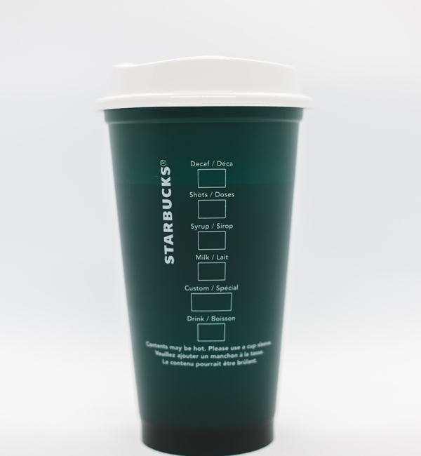
                          <h5 class="card-title">Starbucks</h5>
                        </div>
                      </a>
                      <!-- End Card -->
                    </div>
                    <!-- End Col -->

                    <div class="col-sm-6 col-md-4 mb-5">
                      <!-- Card -->
                      <a class="card card-transition" href="../portfolio-case-study.html">
                        <img class="card-img-top" src="../assets/img/600x650/img5.jpg" alt="Image Description">
                        <div class="card-body">
                          <span class="card-subtitle text-body">Development</span>
                          <h5 class="card-title">Maria Powers</h5>
                        </div>
                      </a>
                      <!-- End Card -->
                    </div>
                    <!-- End Col -->

                    <div class="col-sm-6 col-md-4 mb-5">
                      <!-- Card -->
                      <a class="card card-transition" href="../portfolio-case-study.html">
                        <img class="card-img-top" src="../assets/img/600x650/img6.jpg" alt="Image Description">
                        <div class="card-body">
                          <span class="card-subtitle text-body">Branding</span>
                          <h5 class="card-title">Apollo</h5>
                        </div>
                      </a>
                      <!-- End Card -->
                    </div>
                    <!-- End Col -->
                  </div>
                  <!-- End Row -->

                  <!-- Info -->
                  <div class="text-center">
                    <p class="mb-0">Want to see more?</p>
                    <a class="link" href="../portfolio-modern.html">See all case studies <i class="bi-chevron-right small ms-1"></i></a>
                  </div>
                  <!-- End Info -->
                </div>
                <!-- End Blogs -->
Component #3

Capsule scales at speed with Space
Capsule has turned payments into a competitive advantage working with Space, allowing it to scale at speed across multiple markets.
View story
How Space supports Fitbit transformation
FitBit empowers marketers to create digital marketing dashboards easily and share them with their team.
View story
Building the Perfect Solution for HubSpot
Visitors can build a form or survey before signing up, but in order to save and share it, they need to create an account.
View story
                <!-- Blog Grid -->
                <div class="container">
                  <div class="row">
                    <div class="col-sm-6 col-lg-4 mb-7">
                      <!-- Card -->
                      <div class="card card-flush">
                        <div class="card-pinned">
                          <img class="card-img-top" src="../assets/img/600x400/img1.jpg" alt="Image Description">

                          <div class="card-pinned-top-start">
                            <div class="bg-white rounded p-3">
                              <img class="avatar avatar-lg avatar-4x3" src="../assets/svg/brands/capsule-primary.svg" alt="Logo">
                            </div>
                          </div>
                        </div>

                        <div class="card-body">
                          <h5 class="card-title"><a class="text-dark" href="../page-customer-story.html">Capsule scales at speed with Space</a></h5>
                          <p class="card-text">Capsule has turned payments into a competitive advantage working with Space, allowing it to scale at speed across multiple markets.</p>
                          <a class="card-link" href="../page-customer-story.html">
                            View story <i class="bi-chevron-right small ms-1"></i>
                          </a>
                        </div>
                      </div>
                      <!-- End Card -->
                    </div>
                    <!-- End Col -->

                    <div class="col-sm-6 col-lg-4 mb-7">
                      <!-- Card -->
                      <div class="card card-flush">
                        <div class="card-pinned">
                          <img class="card-img-top" src="../assets/img/600x400/img4.jpg" alt="Image Description">

                          <div class="card-pinned-top-start">
                            <div class="bg-white rounded p-3">
                              <img class="avatar avatar-lg avatar-4x3" src="../assets/svg/brands/fitbit-primary.svg" alt="Logo">
                            </div>
                          </div>
                        </div>

                        <div class="card-body">
                          <h5 class="card-title"><a class="text-dark" href="../page-customer-story.html">How Space supports Fitbit transformation</a></h5>
                          <p class="card-text">FitBit empowers marketers to create digital marketing dashboards easily and share them with their team.</p>
                          <a class="card-link" href="../page-customer-story.html">
                            View story <i class="bi-chevron-right small ms-1"></i>
                          </a>
                        </div>
                      </div>
                      <!-- End Card -->
                    </div>
                    <!-- End Col -->

                    <div class="col-sm-6 col-lg-4 mb-7">
                      <!-- Card -->
                      <div class="card card-flush">
                        <div class="card-pinned">
                          <img class="card-img-top" src="../assets/img/600x400/img5.jpg" alt="Image Description">

                          <div class="card-pinned-top-start">
                            <div class="bg-white rounded p-3">
                              <img class="avatar avatar-lg avatar-4x3" src="../assets/svg/brands/hubspot-primary.svg" alt="Logo">
                            </div>
                          </div>
                        </div>

                        <div class="card-body">
                          <h5 class="card-title"><a class="text-dark" href="../page-customer-story.html">Building the Perfect Solution for HubSpot</a></h5>
                          <p class="card-text">Visitors can build a form or survey before signing up, but in order to save and share it, they need to create an account.</p>
                          <a class="card-link" href="../page-customer-story.html">
                            View story <i class="bi-chevron-right small ms-1"></i>
                          </a>
                        </div>
                      </div>
                      <!-- End Card -->
                    </div>
                    <!-- End Col -->
                  </div>
                  <!-- End Row -->
                </div>
                <!-- End Blog Grid -->
Component #4

Inhouse Design Thinking – How I deal with it?
After an experience in supporting companies in the creation of innovative user-centric services, I joined a large industrial group...
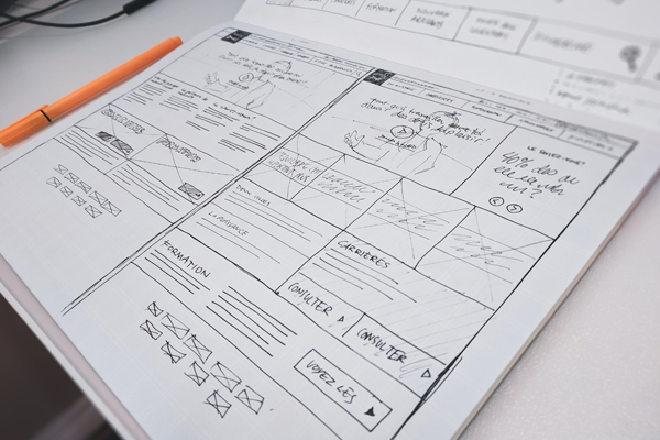
UX writing: Copy is an integral part of ux design
When we talk about digital products or interfaces, we get more concentrated on visual elements such as illustrations, buttons, animations, colors and more...

Design is not only Design sprint. It is a marathon
Design is not only design sprint. Design is a state of mind and takes time to build products and services that bring values to customers.
                <!-- Grid - Blog -->
                <div class="container">
                  <div class="row">
                    <div class="col-sm-6 col-lg-4 mb-5 mb-lg-0">
                      <!-- Card -->
                      <div class="card card-sm h-100">
                        <div class="card-body">
                          <div class="mb-5">
                            <img class="img-fluid" src="../assets/img/600x400/img4.jpg" alt="Image Description">
                          </div>

                          <!-- List Separator -->
                          <ul class="list-inline list-separator mb-3">
                            <li class="list-inline-item">
                              <a class="text-cap text-muted mb-0" href="#">Process</a>
                            </li>
                            <li class="list-inline-item">
                              <a class="text-cap text-muted mb-0" href="#">Use case</a>
                            </li>
                            <li class="list-inline-item">
                              <span class="text-cap text-muted mb-0">4 min read</span>
                            </li>
                          </ul>
                          <!-- End List Separator -->

                          <h5><a class="text-dark" href="../blog-article.html">Inhouse Design Thinking – How I deal with it?</a></h5>
                          <p>After an experience in supporting companies in the creation of innovative user-centric services, I joined a large industrial group...</p>
                        </div>
                      </div>
                      <!-- End Card -->
                    </div>
                    <!-- End Col -->

                    <div class="col-sm-6 col-lg-4 mb-5 mb-lg-0">
                      <!-- Card -->
                      <div class="card card-sm h-100">
                        <div class="card-body">
                          <div class="mb-5">
                            <img class="img-fluid" src="../assets/img/600x400/img12.jpg" alt="Image Description">
                          </div>

                          <!-- List Separator -->
                          <ul class="list-inline list-separator mb-3">
                            <li class="list-inline-item">
                              <a class="text-cap text-muted mb-0" href="#">Design</a>
                            </li>
                            <li class="list-inline-item">
                              <a class="text-cap text-muted mb-0" href="#">Process</a>
                            </li>
                            <li class="list-inline-item">
                              <span class="text-cap text-muted mb-0">2 min read</span>
                            </li>
                          </ul>
                          <!-- End List Separator -->

                          <h5><a class="text-dark" href="../blog-article.html">UX writing: Copy is an integral part of ux design</a></h5>
                          <p>When we talk about digital products or interfaces, we get more concentrated on visual elements such as illustrations, buttons, animations, colors and more...</p>
                        </div>
                      </div>
                      <!-- End Card -->
                    </div>
                    <!-- End Col -->

                    <div class="col-sm-6 col-lg-4">
                      <!-- Card -->
                      <div class="card card-sm h-100">
                        <div class="card-body">
                          <div class="mb-5">
                            <img class="img-fluid" src="../assets/img/600x400/img5.jpg" alt="Image Description">
                          </div>

                          <!-- List Separator -->
                          <ul class="list-inline list-separator mb-3">
                            <li class="list-inline-item">
                              <a class="text-cap text-muted mb-0" href="#">Design</a>
                            </li>
                            <li class="list-inline-item">
                              <a class="text-cap text-muted mb-0" href="#">Process</a>
                            </li>
                            <li class="list-inline-item">
                              <span class="text-cap text-muted mb-0">3 min read</span>
                            </li>
                          </ul>
                          <!-- End List Separator -->

                          <h5><a class="text-dark" href="../blog-article.html">Design is not only Design sprint. It is a marathon</a></h5>
                          <p>Design is not only design sprint. Design is a state of mind and takes time to build products and services that bring values to customers.</p>
                        </div>
                      </div>
                      <!-- End Card -->
                    </div>
                    <!-- End Col -->
                  </div>
                  <!-- End Row -->
                </div>
                <!-- End Grid - Blog -->
