Features Navs
Component #1
Now that we've aligned the details, it's time to get things mapped out and organized.
Learn about our servicesNow that we've aligned the details, it's time to get things mapped out and organized.
Learn about our servicesThis is where we really begin to visualize your napkin sketches and make them into beautiful pixels.
Learn about our servicesWe strive to embrace and drive change in our industry which allows us to keep our clients relevant.
Learn about our servicesSpace offers native notification support for iOS, Android and web, so you can reach your users wherever they are
Learn about our servicesBroadcast information to unlimited subscribed devices using Device Interests, with 1 million+ messages per minute on every platform
Learn about our servicesBroadcast information to unlimited subscribed devices using Device Interests, with 1 million+ messages per minute on every platform
Learn about our servicesBroadcast information to unlimited subscribed devices using Device Interests, with 1 million+ messages per minute on every platform
Learn about our servicesBroadcast information to unlimited subscribed devices using Device Interests, with 1 million+ messages per minute on every platform
Learn about our servicesBroadcast information to unlimited subscribed devices using Device Interests, with 1 million+ messages per minute on every platform
Learn about our servicesNow that we've aligned the details, it's time to get things mapped out and organized.
Learn about our servicesNow that we've aligned the details, it's time to get things mapped out and organized.
Learn about our services
                <!-- Nav -->
                <div class="container content-space-1">
                  <div class="row mb-3 mb-md-10">
                    <div class="col-md-3 mb-5 mb-md-0">
                      <!-- Nav -->
                      <ul class="nav nav-tabs nav-link-gray nav-vertical" id="featuresTab" role="tablist">
                        <li class="nav-item" role="presentation">
                          <a class="nav-link active" href="#one" id="one-tab" data-bs-toggle="tab" data-bs-target="#one" role="tab" aria-controls="one" aria-selected="true">Features</a>
                        </li>
                        <li class="nav-item" role="presentation">
                          <a class="nav-link" href="#two" id="two-tab" data-bs-toggle="tab" data-bs-target="#two" role="tab" aria-controls="two" aria-selected="false">Key benefits</a>
                        </li>
                        <li class="nav-item" role="presentation">
                          <a class="nav-link" href="#three" id="three-tab" data-bs-toggle="tab" data-bs-target="#three" role="tab" aria-controls="three" aria-selected="false">Less routine - more creativity</a>
                        </li>
                      </ul>
                      <!-- End Nav -->
                    </div>
                    <!-- End Col -->

                    <div class="col-md-9">
                      <!-- Tab Content -->
                      <div class="tab-content" id="featuresTabContent">
                        <div class="tab-pane fade show active" id="one" role="tabpanel" aria-labelledby="one-tab">
                          <div class="ps-md-5">
                            <div class="row">
                              <div class="col-sm-6 mb-5">
                                <span class="svg-icon text-primary mb-3">
                                  @@include("../assets/vendor/duotone-icons/gen/gen002.svg")
                                </span>

                                <p>Now that we've aligned the details, it's time to get things mapped out and organized.</p>

                                <a class="link" href="../page-services.html">Learn about our services <i class="bi-chevron-right small ms-1"></i></a>
                              </div>
                              <!-- End Col -->

                              <div class="col-sm-6 mb-5">
                                <span class="svg-icon text-primary mb-3">
                                  @@include("../assets/vendor/duotone-icons/fin/fin008.svg")
                                </span>

                                <p>Now that we've aligned the details, it's time to get things mapped out and organized.</p>

                                <a class="link" href="../page-services.html">Learn about our services <i class="bi-chevron-right small ms-1"></i></a>
                              </div>
                              <!-- End Col -->
                            </div>
                            <!-- End Row -->

                            <div class="row">
                              <div class="col-sm-6 mb-5">
                                <span class="svg-icon text-primary mb-3">
                                  @@include("../assets/vendor/duotone-icons/gra/gra006.svg")
                                </span>

                                <p>This is where we really begin to visualize your napkin sketches and make them into beautiful pixels.</p>

                                <a class="link" href="../page-services.html">Learn about our services <i class="bi-chevron-right small ms-1"></i></a>
                              </div>
                              <!-- End Col -->

                              <div class="col-sm-6 mb-5">
                                <span class="svg-icon text-primary mb-3">
                                  @@include("../assets/vendor/duotone-icons/elc/elc002.svg")
                                </span>

                                <p>We strive to embrace and drive change in our industry which allows us to keep our clients relevant.</p>

                                <a class="link" href="../page-services.html">Learn about our services <i class="bi-chevron-right small ms-1"></i></a>
                              </div>
                              <!-- End Col -->
                            </div>
                            <!-- End Row -->
                          </div>
                        </div>

                        <div class="tab-pane fade" id="two" role="tabpanel" aria-labelledby="two-tab">
                          <div class="ps-md-5">
                            <div class="row">
                              <div class="col-sm-6 mb-5">
                                <span class="svg-icon text-primary mb-3">
                                  @@include("../assets/vendor/duotone-icons/art/art007.svg")
                                </span>

                                <p>Space offers native notification support for iOS, Android and web, so you can reach your users wherever they are</p>

                                <a class="link" href="../page-services.html">Learn about our services <i class="bi-chevron-right small ms-1"></i></a>
                              </div>
                              <!-- End Col -->

                              <div class="col-sm-6 mb-5">
                                <span class="svg-icon text-primary mb-3">
                                  @@include("../assets/vendor/duotone-icons/com/com007.svg")
                                </span>

                                <p>Broadcast information to unlimited subscribed devices using Device Interests, with 1 million+ messages per minute on every platform</p>

                                <a class="link" href="../page-services.html">Learn about our services <i class="bi-chevron-right small ms-1"></i></a>
                              </div>
                              <!-- End Col -->
                            </div>
                            <!-- End Row -->

                            <div class="row">
                              <div class="col-sm-6 mb-5">
                                <span class="svg-icon text-primary mb-3">
                                  @@include("../assets/vendor/duotone-icons/teh/teh004.svg")
                                </span>

                                <p>Broadcast information to unlimited subscribed devices using Device Interests, with 1 million+ messages per minute on every platform</p>

                                <a class="link" href="../page-services.html">Learn about our services <i class="bi-chevron-right small ms-1"></i></a>
                              </div>
                              <!-- End Col -->

                              <div class="col-sm-6 mb-5">
                                <span class="svg-icon text-primary mb-3">
                                  @@include("../assets/vendor/duotone-icons/gra/gra011.svg")
                                </span>

                                <p>Broadcast information to unlimited subscribed devices using Device Interests, with 1 million+ messages per minute on every platform</p>

                                <a class="link" href="../page-services.html">Learn about our services <i class="bi-chevron-right small ms-1"></i></a>
                              </div>
                              <!-- End Col -->
                            </div>
                            <!-- End Row -->
                          </div>
                        </div>

                        <div class="tab-pane fade" id="three" role="tabpanel" aria-labelledby="three-tab">
                          <div class="ps-md-5">
                            <div class="row">
                              <div class="col-sm-6 mb-5">
                                <span class="svg-icon text-primary mb-3">
                                  @@include("../assets/vendor/duotone-icons/teh/teh004.svg")
                                </span>

                                <p>Broadcast information to unlimited subscribed devices using Device Interests, with 1 million+ messages per minute on every platform</p>

                                <a class="link" href="../page-services.html">Learn about our services <i class="bi-chevron-right small ms-1"></i></a>
                              </div>
                              <!-- End Col -->

                              <div class="col-sm-6 mb-5">
                                <span class="svg-icon text-primary mb-3">
                                  @@include("../assets/vendor/duotone-icons/gra/gra011.svg")
                                </span>

                                <p>Broadcast information to unlimited subscribed devices using Device Interests, with 1 million+ messages per minute on every platform</p>

                                <a class="link" href="../page-services.html">Learn about our services <i class="bi-chevron-right small ms-1"></i></a>
                              </div>
                              <!-- End Col -->
                            </div>
                            <!-- End Row -->

                            <div class="row">
                              <div class="col-sm-6 mb-5">
                                <span class="svg-icon text-primary mb-3">
                                  @@include("../assets/vendor/duotone-icons/gen/gen002.svg")
                                </span>

                                <p>Now that we've aligned the details, it's time to get things mapped out and organized.</p>

                                <a class="link" href="../page-services.html">Learn about our services <i class="bi-chevron-right small ms-1"></i></a>
                              </div>
                              <!-- End Col -->

                              <div class="col-sm-6 mb-5">
                                <span class="svg-icon text-primary mb-3">
                                  @@include("../assets/vendor/duotone-icons/fin/fin008.svg")
                                </span>

                                <p>Now that we've aligned the details, it's time to get things mapped out and organized.</p>

                                <a class="link" href="../page-services.html">Learn about our services <i class="bi-chevron-right small ms-1"></i></a>
                              </div>
                              <!-- End Col -->
                            </div>
                            <!-- End Row -->
                          </div>
                        </div>
                      </div>
                      <!-- End Tab Content -->
                    </div>
                    <!-- End Col -->
                  </div>
                  <!-- End Row -->

                  <div class="mx-auto" style="max-width: 31.25rem;">
                    <!-- Alert -->
                    <div class="alert alert-soft-primary" role="alert">
                      <div class="d-sm-flex align-items-sm-center">
                        <div class="flex-shrink-0 mb-3 mb-sm-0">
                          <span class="svg-icon text-primary">


                          </span>
                        </div>

                        <div class="flex-grow-1 text-dark ms-sm-3 mb-3 mb-sm-0">Empowering independent business owners everywhere</div>

                        <div class="flex-shrink-0 ms-sm-3">
                          <a class="btn btn-primary" href="#">Try for free</a>
                        </div>
                      </div>
                    </div>
                    <!-- End Alert -->
                  </div>
                </div>
                <!-- End Nav -->
Component #2
                <!-- Features -->
                <div class="container content-space-1">
                  <!-- Nav Scroller -->
                  <div class="js-nav-scroller hs-nav-scroller-horizontal">
                    <span class="hs-nav-scroller-arrow-prev" style="display: none;">
                      <a class="hs-nav-scroller-arrow-link" href="javascript:;">
                        <i class="bi-chevron-left"></i>
                      </a>
                    </span>

                    <span class="hs-nav-scroller-arrow-next" style="display: none;">
                      <a class="hs-nav-scroller-arrow-link" href="javascript:;">
                        <i class="bi-chevron-right"></i>
                      </a>
                    </span>

                    <!-- Nav Pills -->
                    <ul class="nav nav-pills mb-7" id="featuresTabEg2" role="tablist">
                      <li class="nav-item" role="presentation">
                        <a class="nav-link active" href="#featuresOne" id="featuresOne-tab" data-bs-toggle="tab" data-bs-target="#featuresOne" role="tab" aria-controls="featuresOne" aria-selected="true" style="width: 22rem;">
                          <div class="d-flex">
                            <div class="flex-shrink-0">
                              <span class="svg-icon svg-icon-sm text-primary">
                                @@include("../assets/vendor/duotone-icons/abs/abs028.svg")
                              </span>
                            </div>

                            <div class="flex-grow-1 ms-3">
                              <h6 class="nav-title">All-in-one workspace</h6>
                              <p class="nav-text text-body">Create a business, whether you’ve got a fresh idea.</p>
                            </div>
                          </div>
                        </a>
                      </li>

                      <li class="nav-item" role="presentation">
                        <a class="nav-link" href="#featuresTwo" id="featuresTwo-tab" data-bs-toggle="tab" data-bs-target="#featuresTwo" role="tab" aria-controls="featuresTwo" aria-selected="false" style="width: 22rem;">
                          <div class="d-flex">
                            <div class="flex-shrink-0">
                              <span class="svg-icon svg-icon-sm text-primary">
                                @@include("../assets/vendor/duotone-icons/abs/abs026.svg")
                              </span>
                            </div>

                            <div class="flex-grow-1 ms-3">
                              <h6 class="nav-title">Automation on a whole new level</h6>
                              <p class="nav-text text-body">Use automation to scale campaigns profitably and save time doing it.</p>
                            </div>
                          </div>
                        </a>
                      </li>

                      <li class="nav-item" role="presentation">
                        <a class="nav-link" href="#featuresThree" id="featuresThree-tab" data-bs-toggle="tab" data-bs-target="#featuresThree" role="tab" aria-controls="featuresThree" aria-selected="false" style="width: 22rem;">
                          <div class="d-flex">
                            <div class="flex-shrink-0">
                              <span class="svg-icon svg-icon-sm text-primary">
                                @@include("../assets/vendor/duotone-icons/cod/cod009.svg")
                              </span>
                            </div>

                            <div class="flex-grow-1 ms-3">
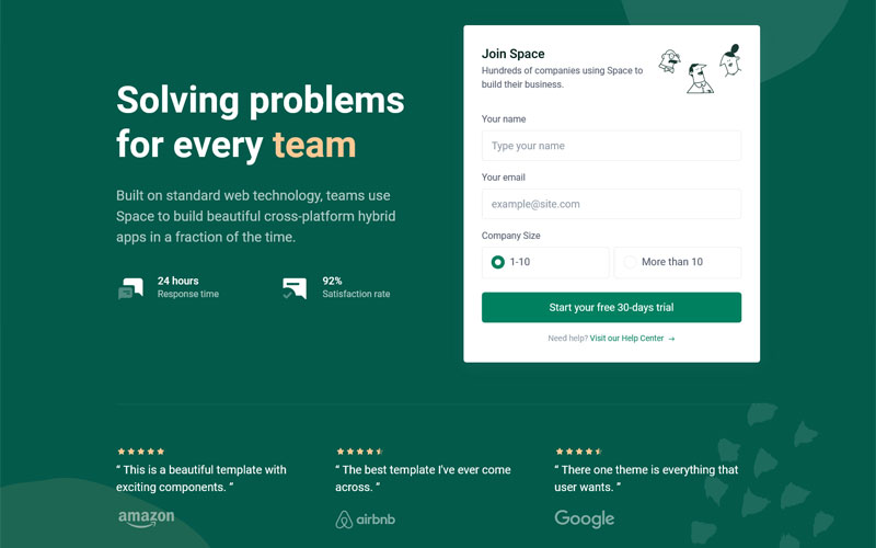
                              <h6 class="nav-title">Solving problems for every team</h6>
                              <p class="nav-text text-body">One tool for your company to share knowledge and ship projects.</p>
                            </div>
                          </div>
                        </a>
                      </li>
                    </ul>
                    <!-- End Nav Pills -->
                  </div>
                  <!-- End Nav Scroller -->

                  <!-- Tab Content -->
                  <div class="tab-content" id="featuresTabEg2Content">
                    <div class="tab-pane fade show active" id="featuresOne" role="tabpanel" aria-labelledby="featuresOne-tab">
                      <!-- Devices -->
                      <div class="devices">
                        <!-- Mobile Device -->
                        <figure class="device-mobile">
                          <div class="device-mobile-frame">
                            <img class="device-mobile-img" src="../assets/img/240x480/img3.jpg" alt="Image Description">
                          </div>
                        </figure>
                        <!-- End Mobile Device -->

                        <!-- Browser Device -->
                        <figure class="device-browser">
                          <div class="device-browser-header">
                            <div class="device-browser-header-btn-list">
                              <span class="device-browser-header-btn-list-btn"></span>
                              <span class="device-browser-header-btn-list-btn"></span>
                              <span class="device-browser-header-btn-list-btn"></span>
                            </div>
                            <div class="device-browser-header-browser-bar">www.htmlstream.com/space/</div>
                          </div>

                          <div class="device-browser-frame">
                            <img class="device-browser-img" src="../assets/img/800x500/img8.jpg" alt="Image Description">
                          </div>
                        </figure>
                        <!-- End Browser Device -->
                      </div>
                      <!-- End Devices -->
                    </div>

                    <div class="tab-pane fade" id="featuresTwo" role="tabpanel" aria-labelledby="featuresTwo-tab">
                      <!-- Devices -->
                      <div class="devices">
                        <!-- Mobile Device -->
                        <figure class="device-mobile">
                          <div class="device-mobile-frame">
                            <img class="device-mobile-img" src="../assets/img/240x480/img4.jpg" alt="Image Description">
                          </div>
                        </figure>
                        <!-- End Mobile Device -->

                        <!-- Browser Device -->
                        <figure class="device-browser">
                          <div class="device-browser-header">
                            <div class="device-browser-header-btn-list">
                              <span class="device-browser-header-btn-list-btn"></span>
                              <span class="device-browser-header-btn-list-btn"></span>
                              <span class="device-browser-header-btn-list-btn"></span>
                            </div>
                            <div class="device-browser-header-browser-bar">www.htmlstream.com/space/</div>
                          </div>

                          <div class="device-browser-frame">
                            <img class="device-browser-img" src="../assets/img/800x500/img6.jpg" alt="Image Description">
                          </div>
                        </figure>
                        <!-- End Browser Device -->
                      </div>
                      <!-- End Devices -->
                    </div>

                    <div class="tab-pane fade" id="featuresThree" role="tabpanel" aria-labelledby="featuresThree-tab">
                      <!-- Devices -->
                      <div class="devices">
                        <!-- Mobile Device -->
                        <figure class="device-mobile">
                          <div class="device-mobile-frame">
                            <img class="device-mobile-img" src="../assets/img/240x480/img2.jpg" alt="Image Description">
                          </div>
                        </figure>
                        <!-- End Mobile Device -->

                        <!-- Browser Device -->
                        <figure class="device-browser">
                          <div class="device-browser-header">
                            <div class="device-browser-header-btn-list">
                              <span class="device-browser-header-btn-list-btn"></span>
                              <span class="device-browser-header-btn-list-btn"></span>
                              <span class="device-browser-header-btn-list-btn"></span>
                            </div>
                            <div class="device-browser-header-browser-bar">www.htmlstream.com/space/</div>
                          </div>

                          <div class="device-browser-frame">
                            <img class="device-browser-img" src="../assets/img/800x500/img1.jpg" alt="Image Description">
                          </div>
                        </figure>
                        <!-- End Browser Device -->
                      </div>
                      <!-- End Devices -->
                    </div>
                  </div>
                  <!-- End Tab Content -->
                </div>
                <!-- End Features -->
